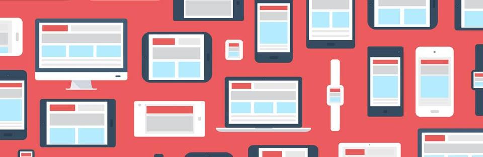
What's the responsive?
You've heard the term, but you do not know exactly what it is. All sites talk about "responsive" by it, "responsive" by then. We will deepen what the responsive in this article!
The responsive is relatively new in the world of web and has been democratized with the arrival of mobile devices such as smartphones and tablets. More and more people are using these devices to browse the Internet.
You've probably been to a site where you have been forced to zoom with your fingers to read the information, and after zooming, you were forced to "scroll" in every way ... It never ends ... you can say goodbye to this problem with responsive!
responsive allows your website to automatically adapt to any format. Using this technique, the content of your site adapts to mobile devices and enables it to offer a smooth ride and a professional look on all media.
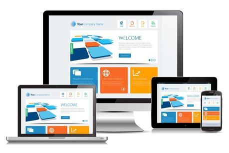
Themes 100% responsive
Visualize your website on your smartphone on the subway, or on your tablet for an appointment: Webgenie features themed responsifs 100%, you have nothing to do, all our themes automatically adapt to mobile devices without you having to reach into the code!
See next articles

To position your images on your site
Published on 30/11/-0001
Studies show that we retain 50 times faster than a text image! A relevant image is 50 times more powerful in terms of communication than text. Some social networks such as Pinterest, Instagram or Tumblr understood this principle. Their popularity and reputation continues to grow. The image quality is paramount...

Creation auto entrepreneur website
Published on 30/11/-0001
Why create a website when one is self contractor? You had a project and you have taken the plunge: you now have the status of auto-entrepreneur. Your new challenge is to find customers and their trusted. Marketing tools that large companies use generally cost very expensive and are rarely in the budget autoentrepreneurs...
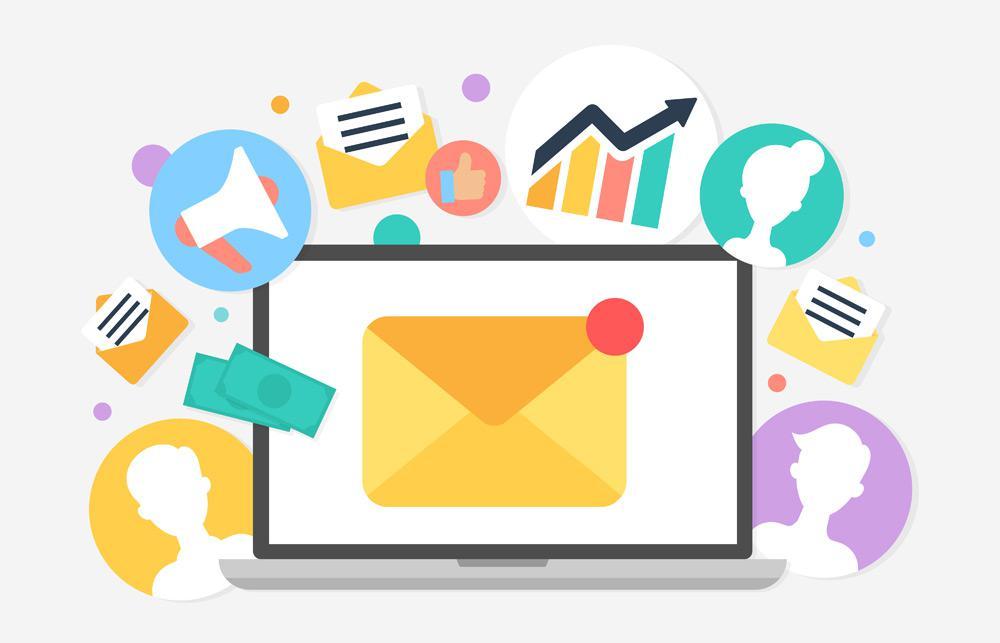
Good practices of emailing
Published on 30/11/-0001
L&# 39; email may well be the&# 39; the oldest online communication tool, n&# 39; nonetheless the most interesting to market your website with your prospects. Indeed, the&# 39; email remains aujourd&# 39; hui s&# 39; the most effective tool: it is very convenient because it allows to reach thousands of people...
All rights reserved Webgenie 2019