How to choose the right colors for your website?
It is difficult to find the right colors for your website if you are not a graphic designer. Select consistent and harmonious colors is crucial for your website to be attractive and professional. Each color triggers an emotion. If the colors of your site are not consistent with your corporate identity, the feeling of your visitors will be distorted. For some people, it may even be off-putting. There are color codes that you must observe. In this article, we'll explore what the significance of the colors for your site!
The colors and your visual identity
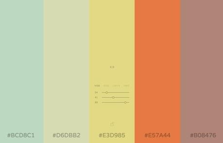
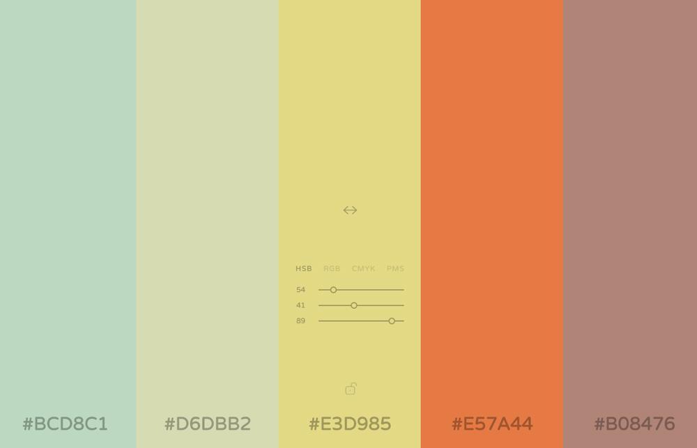
It is important that your colors are consistent with your corporate identity. If you used your logo in blue, use blue and complementary colors in your site. Do not try to mix too many colors. Generally, it should not exceed more than 3 colors in a graphic: 1-2 dominant colors and 1 to 2 complementary colors (eg gray or a variation of your dominant colors).
The colors "call to action"
The "call to action" (call for action) are the navigation elements on your site that will push your visitors to click. For example, type buttons "Buy", "I take this opportunity," "See more" or "Order! "It is important to find an attractive color and complements your dominant colors for this type of item.
How to choose the right colors?
Each color gives off an emotion, here are some tips for choosing the right colors for your business:
Red, orange and yellow: the colors are strong and vibrant. The red evokes action, dynamism and power. Orange is a color a little less aggressive, which also releases energy, dynamism. It is advisable to promote orange to red, because red can be aggressive and should be used sparingly. Yellow is more gay and evokes the holidays, sun and happiness. These three colors are perfect for boosting your site.

Green, blue, purple: green is a color zen, natural, ecological, while the blue color is a calm, soothing and reassuring. These two colors are easy to use on a site because they are not aggressive and can be used with tonal variations. Purple is a romantic color, feminine but also relaxing and calm.
Gray, black, white: these colors are very convenient because they are colored mat and that may very well be combined with other colors. It is advisable to use white in your site to maintain clarity. A text on white background is more readable than on a colored background. Black and gray are stronger colors and going very well for titles and subtitles. They are regularly used to demarcate the end of a site, the "footer" (the foot) of your site.
See next articles

How to create a construction and building site
Published on 30/11/-0001
See the demo version for free template website for the building and construction At Webgenie here, we put all our knowledge to find the best design for your site. With our site creation system online, create yourself your own website in minutes. If you are a builder, a carpenter, a plumber or a carpenter,...

Why create a website
Published on 30/11/-0001
Do I need&# 39; a website? A-Will website bring me clients? How much will it cost me? If you ask these questions, c&# 39; is that you begin to realize that d&# 39; appear on the Internet more and more&# 39; importance. Today&# 39; hui, youth 15-25 years (thirty tomorrow) n&# 39; use more than one directory...
Choosing the right colors for your site
Published on 30/11/-0001
It is difficult to find the right colors for your site if you don&# 39; re not a graphic designer. Select consistent and harmonious colors is crucial for your website to be attractive and professional. Each color triggers an emotion. If the colors of your site are not consistent with your corporate identity,...
All rights reserved Webgenie 2019